Shadow
by Anish Kapoor, 2007
Portfolio of 9 colour etchings.
Edition
of 35. Each print signed by the artist and numbered on the reverse
- 149 x 65 cm (19 5/16 x 25 9/16 in)
- 249 x 65 cm (19 5/16 x 25 9/16 in)
- 349 x 65 cm (19 5/16 x 25 9/16 in)
- 449 x 65 cm (19 5/16 x 25 9/16 in)
- 549 x 65 cm (19 5/16 x 25 9/16 in)
- 649 x 65 cm (19 5/16 x 25 9/16 in)
- 749 x 65 cm (19 5/16 x 25 9/16 in)
- 849 x 65 cm (19 5/16 x 25 9/16 in)
- 949 x 65 cm (19 5/16 x 25 9/16 in)
At the same time as working on History and 12 Etchings, Kapoor and Kosowicz experimented with different ways of blending colours using the etching process. Kapoor was keen to achieve deep vibrant colours by overlaying subtly gradated tones. Kosowicz made plates from halftone positive films generated digitally, using the computer program Illustrator. Halftone is a way of simulating continuous tones with equally spaced dots of varying sizes, which the eye optically blends into smooth tones. In a test run Kosowicz printed two polymer plates, with slightly different colours, on top of each other and this, by chance, created a moiré effect. The moiré or interference pattern was the result of wet paper being stretched and compressed as it is pushed through the printing press. This happy accident had a profound influence on Kapoor’s printmaking. A side-effect of superimposing two regular patterns, moiré is a common problem in colour printing, and normally avoided at all costs through careful calibration and adjustment during the printing process. Kapoor, however, was intrigued, and instantly recognized its potential to produce extraordinary colour modulations. In further trials, by tweaking the registration of the plates, Kozowicz managed to control and fine-tune the extent of patterns appearing. Kapoor liked the fact that such a mechanical and moreover computer-generated process can produce images that appear so organic and natural.
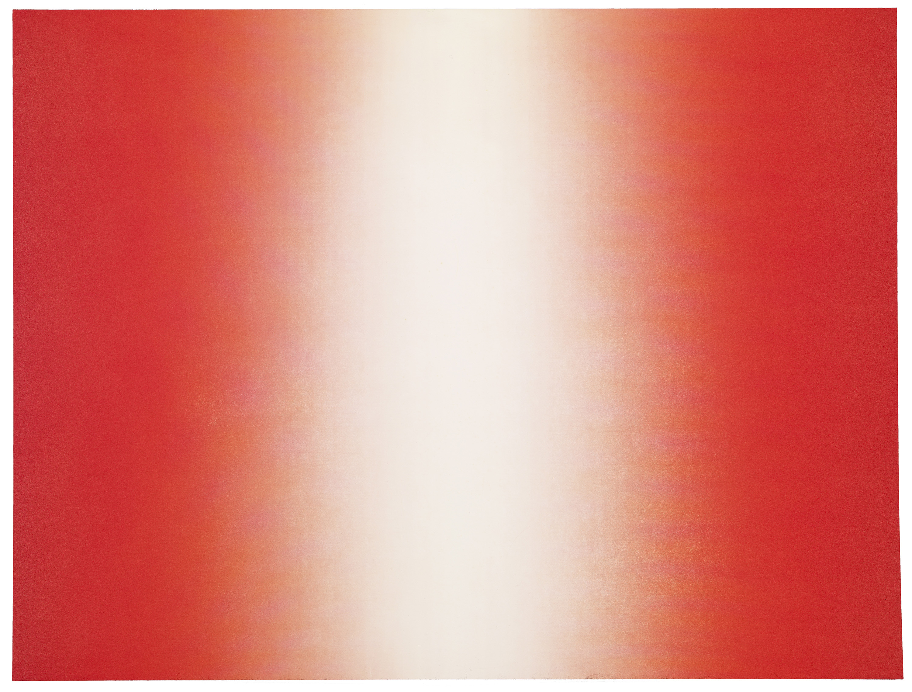
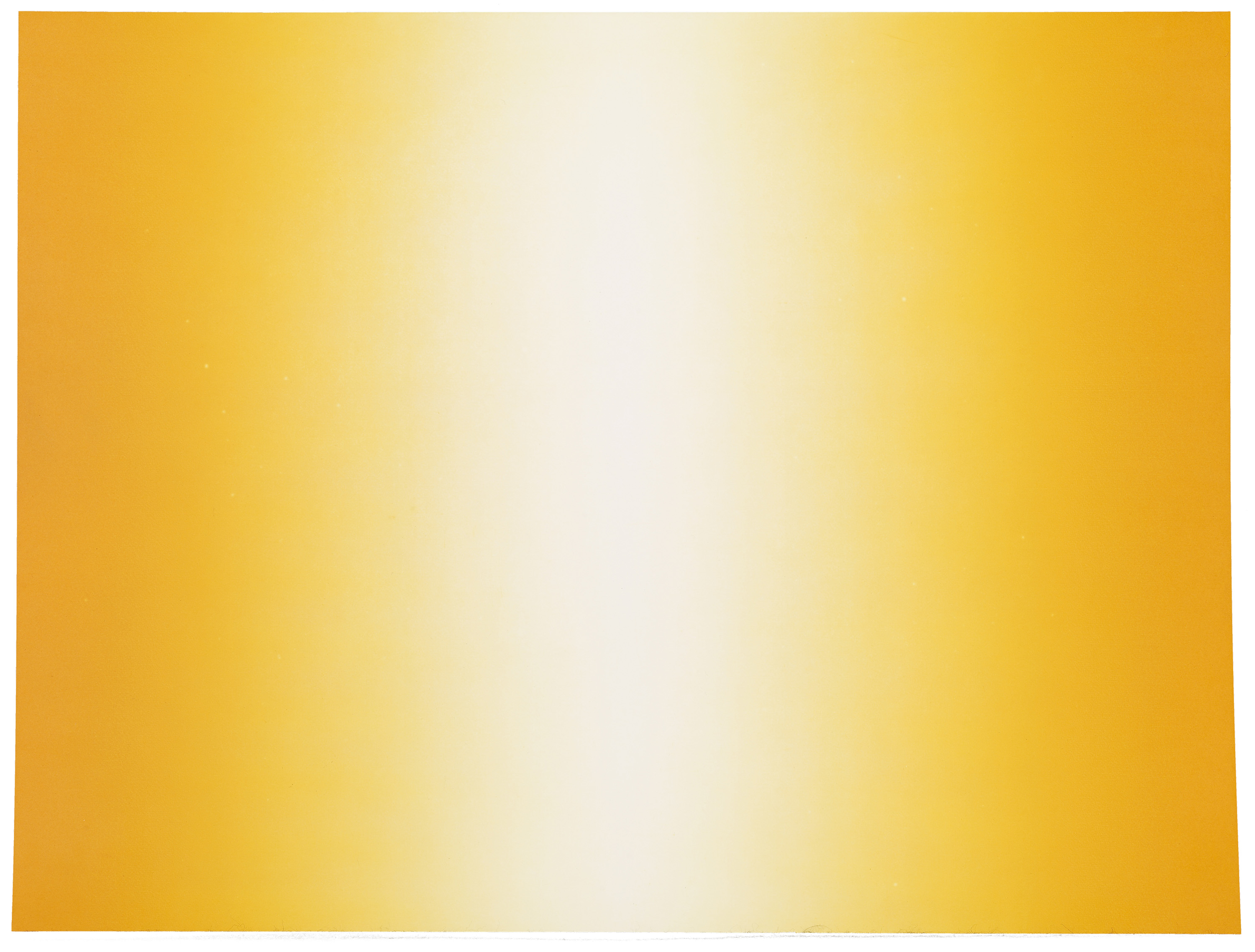
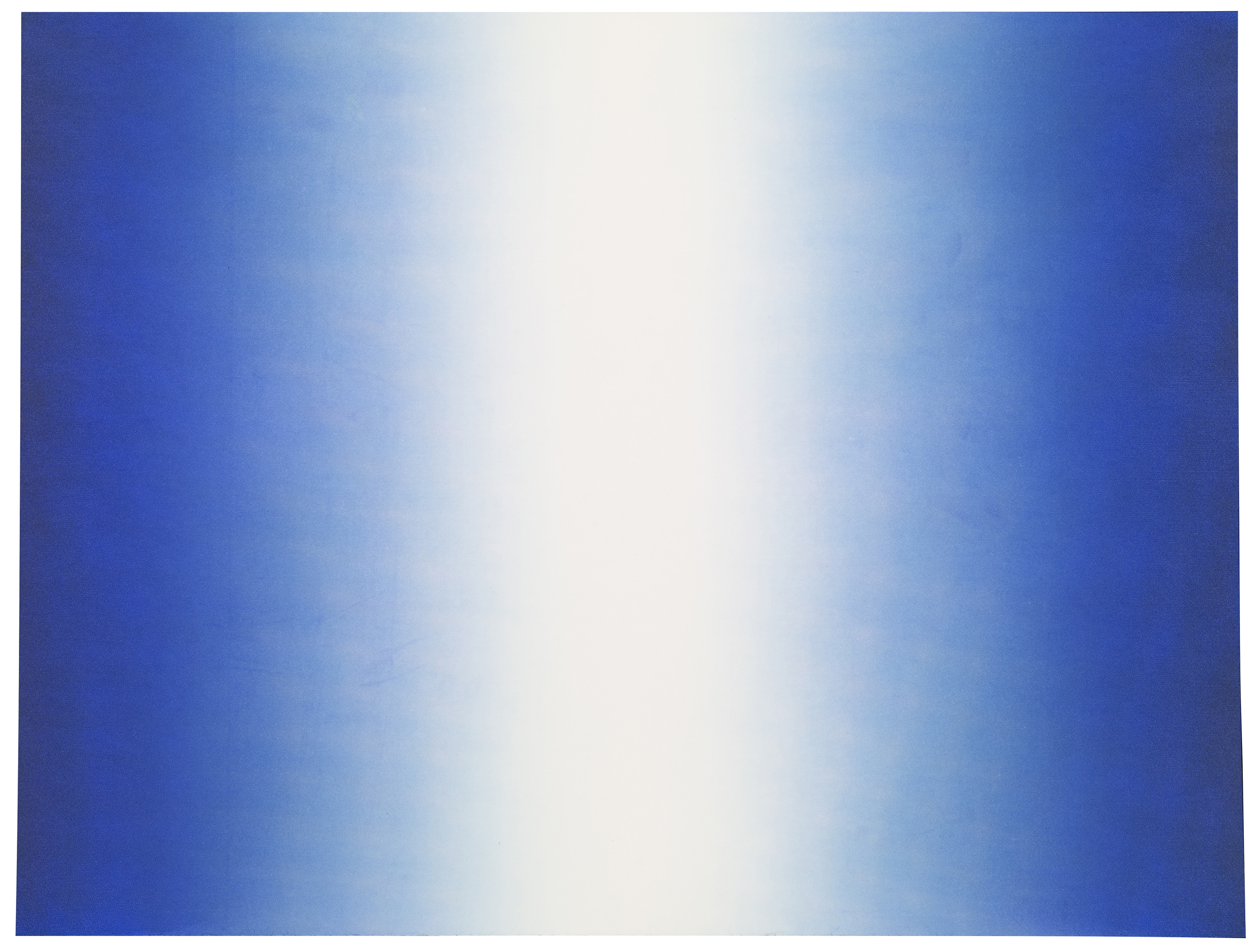
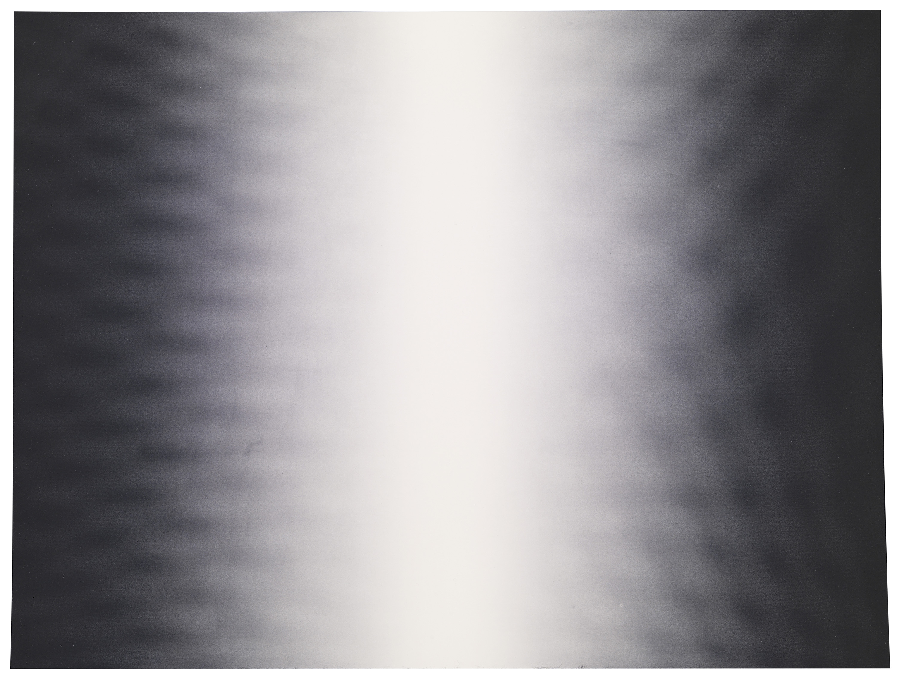
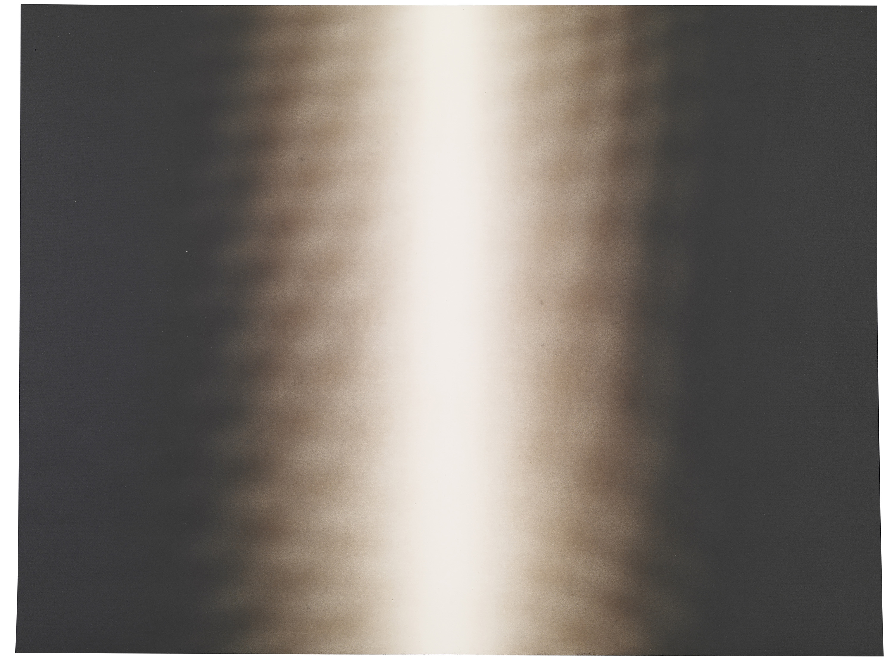
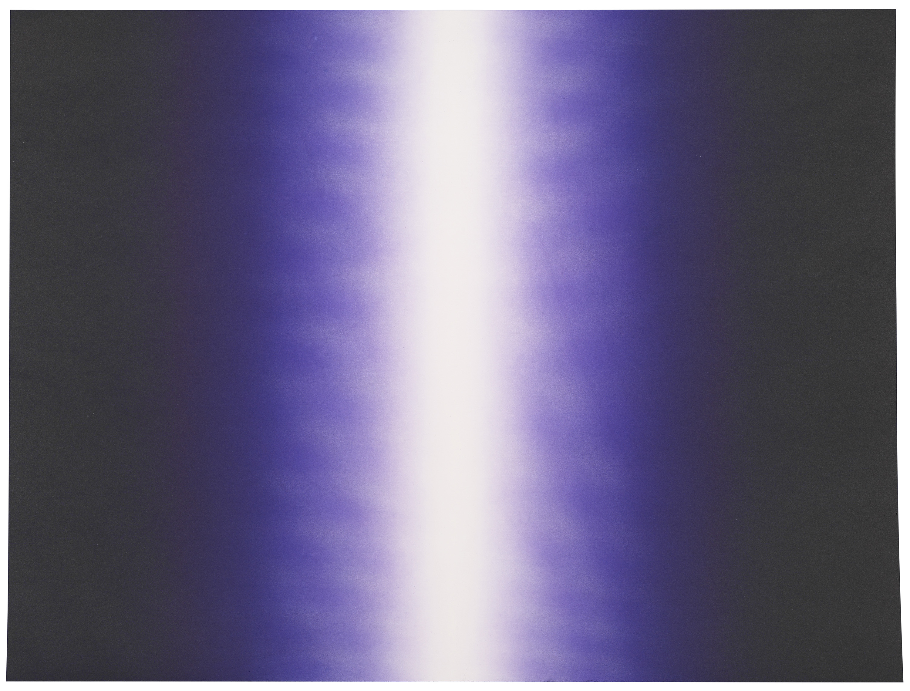
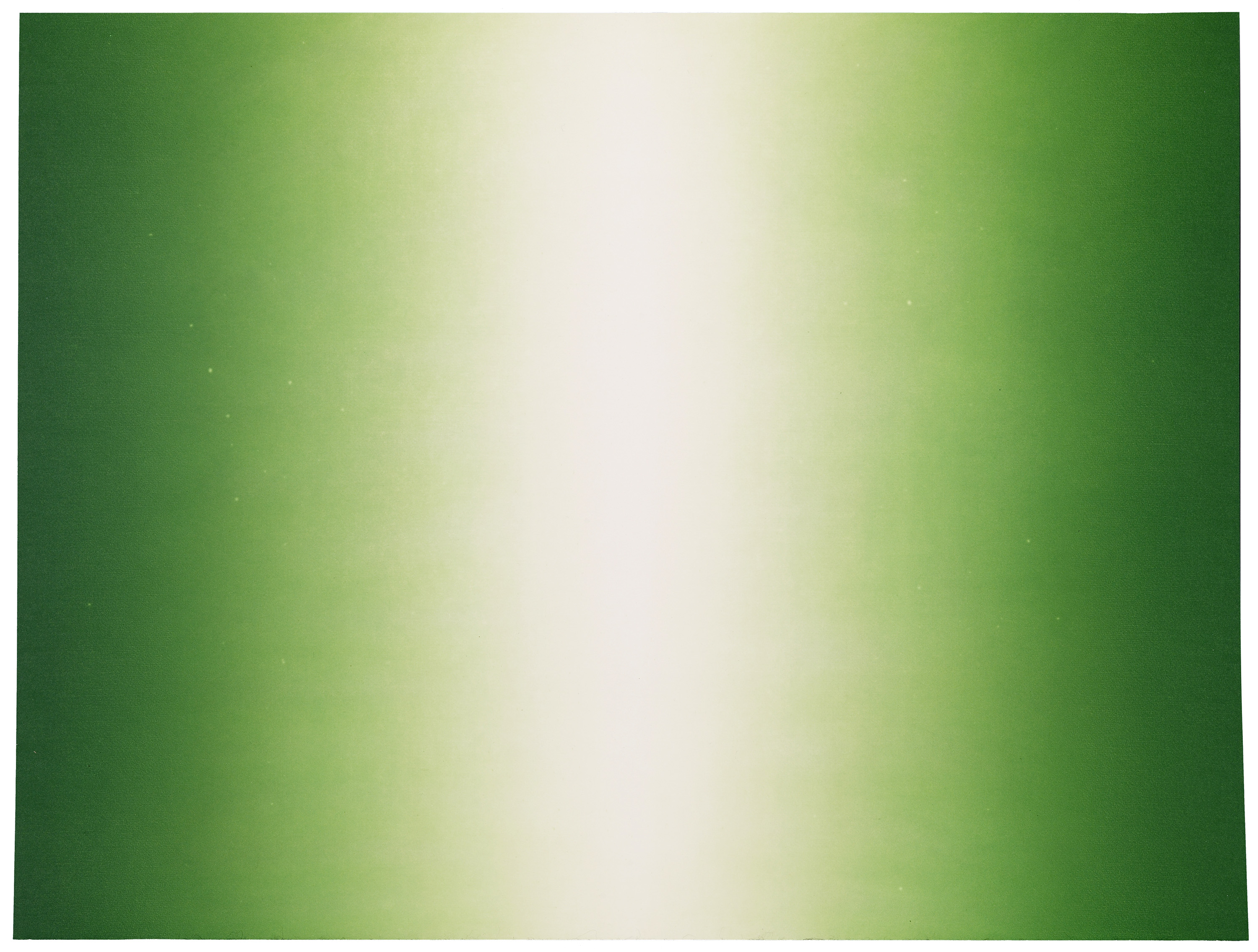
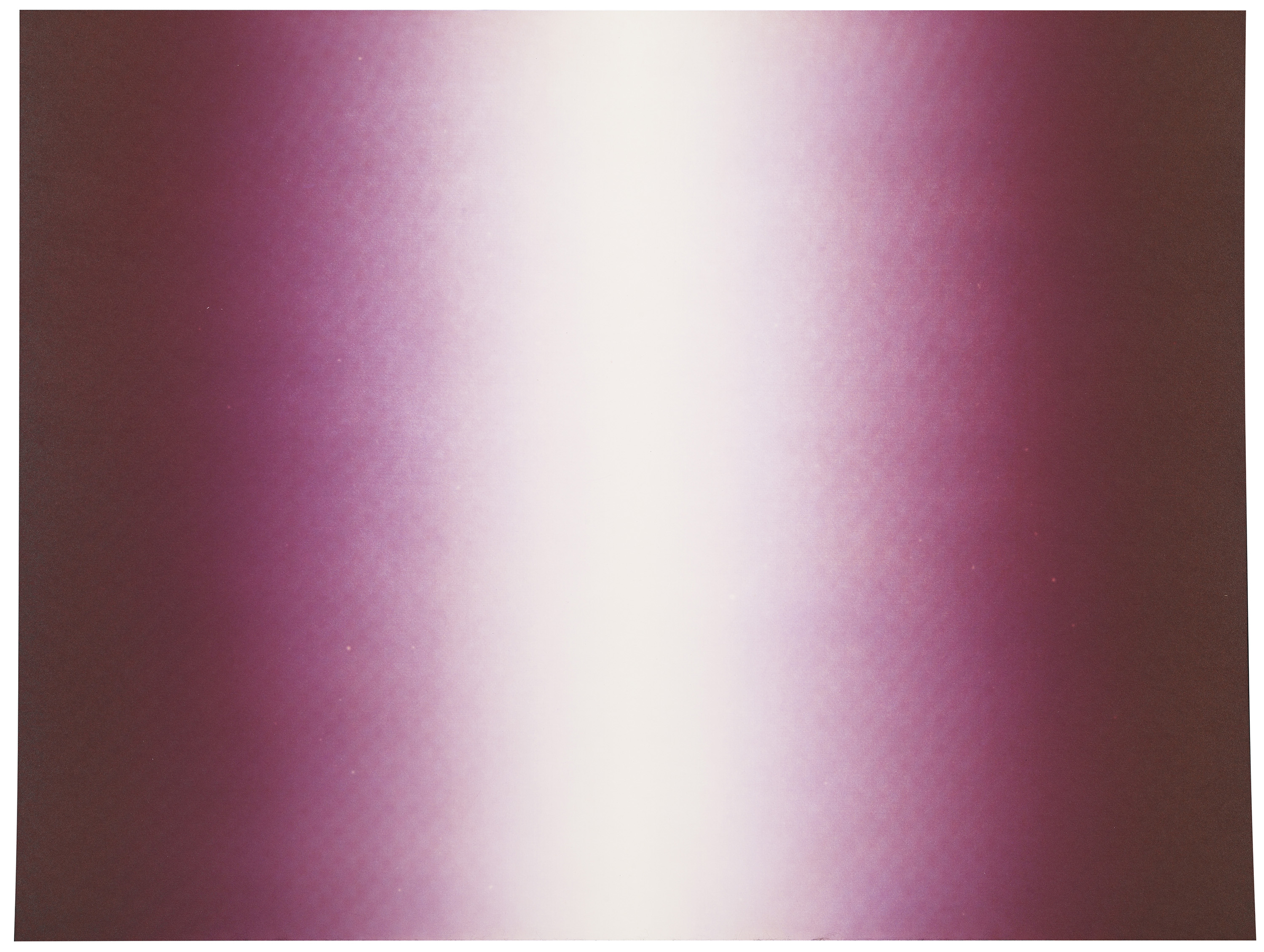
From the outset he envisaged the Shadow etchings as a sequence of separate series, which would allow him to explore a combination of different formal vehicles with varying colours. Each series is part of larger continuum.
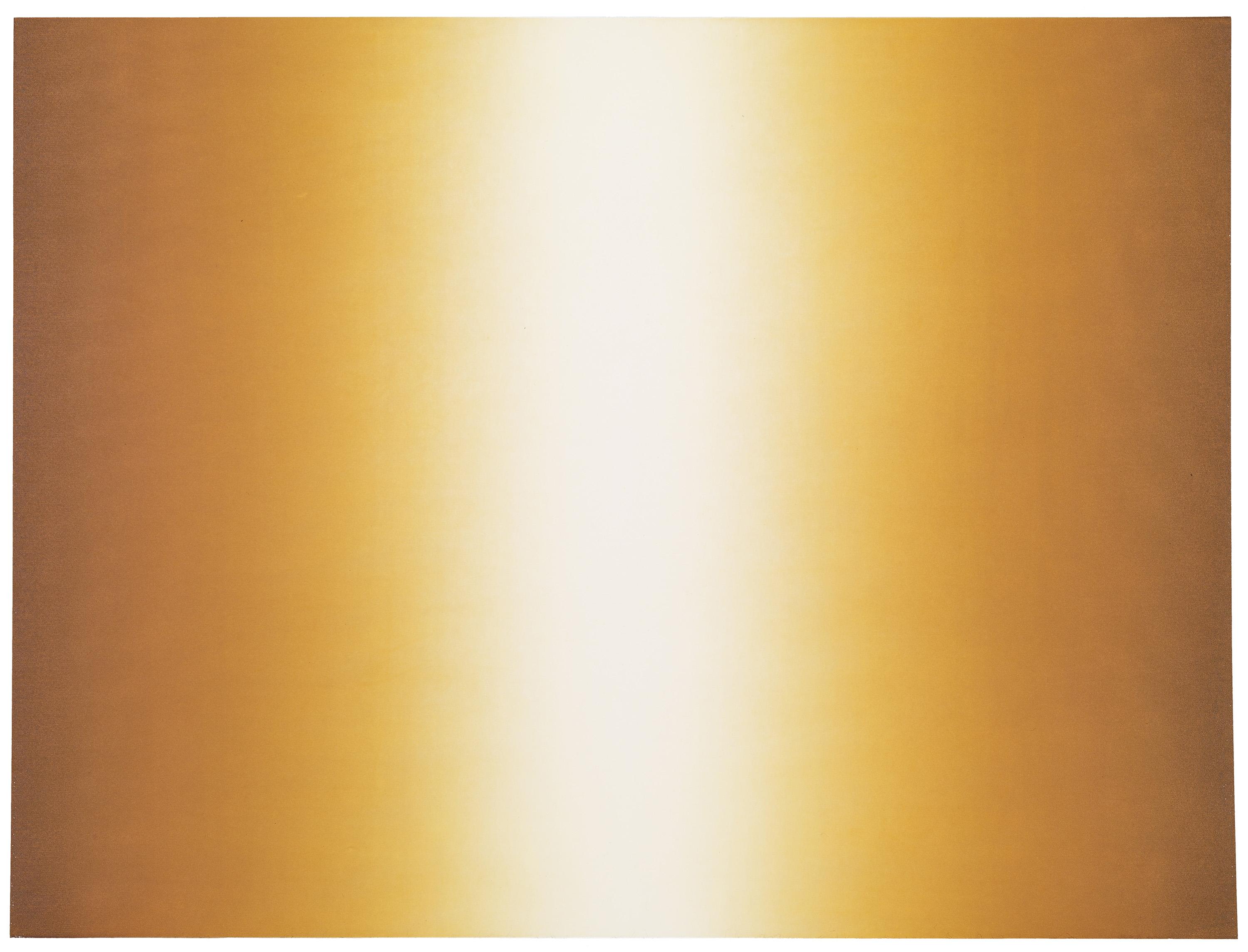
For the first series, Shadow I, he chose a vertical format, where the strong saturated colours evaporate towards a seemingly white centre. Shadow II takes the form of colour fading inward, towards a circular ethereal centre. For the third series, Shadow III, the size of the prints was doubled, but its horizontal lines are a variation on the first series. All prints are printed from two plates combining to shades of yellow, green, blue etc. Kapoor gently and gradually altered the subtle tonal range over the succession of the series. The three Shadow series are the visual equivalent of a fugue, and Kapoor has given each series its own unique character.
The series are nevertheless united in that they share two key themes prevalent in Kapoor’s three-dimensional work – the pigment and the void. The saturated ink echoes the pigment employed in some of Kapoor’s sculptural pieces. The subtle gradations of colour, from deep and drenched to faded and almost white, bring about a disorientation in our perception of the two-dimensional nature of the work. These compositions push and pull the eye and wilfully destabilize our perception. The ambivalence between depth and surface manipulates our sense of space in ways not unlike the effect of his sculptures, absorbing us in a visceral experience of form and colour. Kapoor has grouped the three series under the umbrella title Shadow – an apt title for works that embody a contemporary colour-infused reading of chiaroscuro, the modelling of form by almost imperceptible gradations of light and dark. Kosowicz very much enjoyed working on the Shadow series and ‘the fact that they are pure printmaking and could not be made any other way’. A fortuitous distortion has thus triggered a new flowering of Kapoor’s printmaking.